Chart Vizzard
Vizzlos KI-basierter Diagramm-GeneratorThe Ozempic Era: U.S. Obesity Is Falling
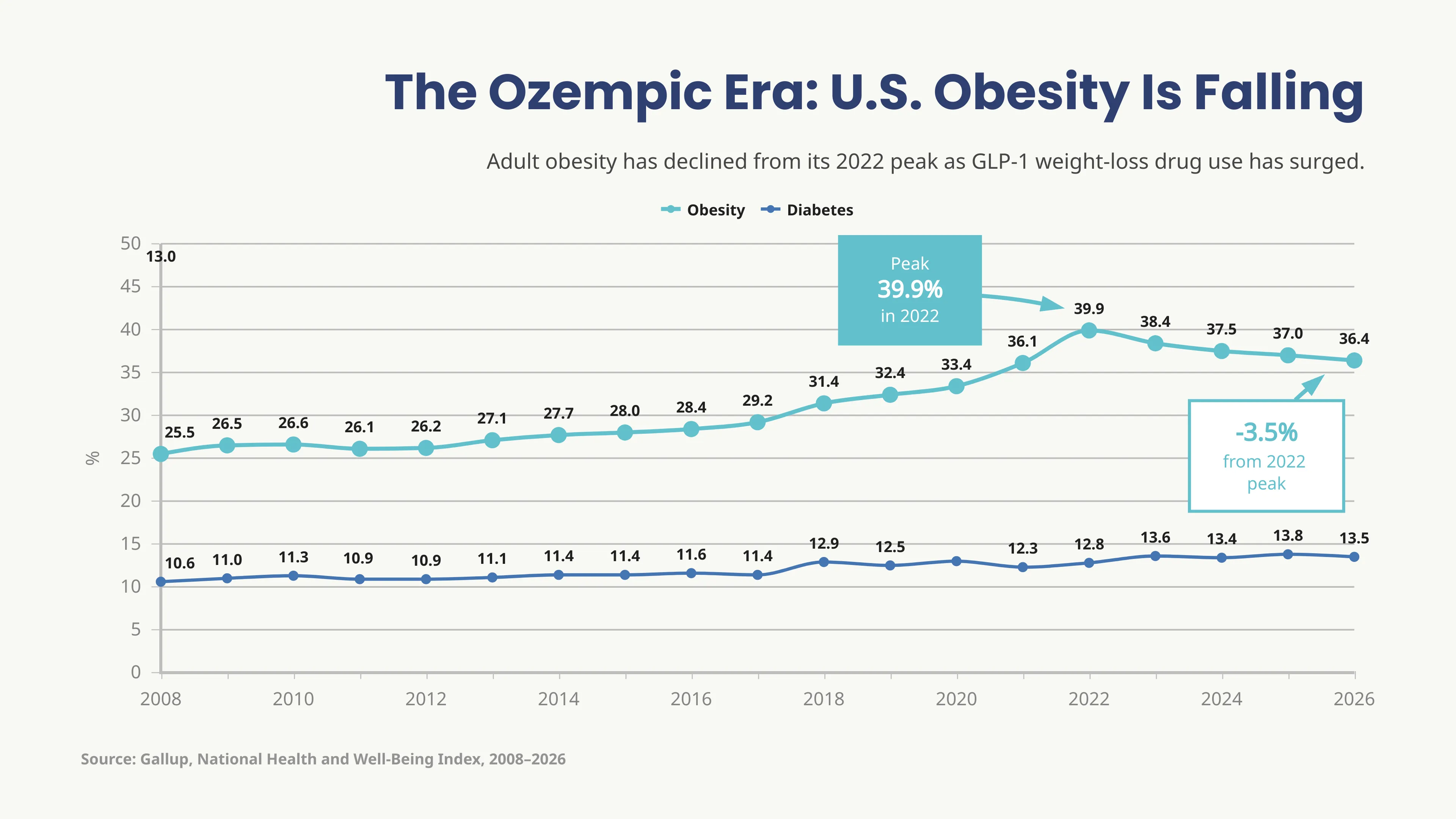
The Ozempic Era: U.S. Obesity Is Falling is a line graph that visualizes how adult obesity and diabetes prevalence in the United States evolved from 2008 to 2026. The chart compares two time series, obesity and diabetes, showing their year-by-year percentage values over time. It highlights that obesity rose from 25.5% in 2008 to a peak of 39.9% in 2022, before declining to 36.4% in 2026. Over the same period, diabetes increased more gradually, rising from 10.6% in 2008 to 13.5% in 2026.
The visualization shows two distinct but related health trends. Obesity increased steadily for more than a decade, accelerated sharply after 2017, and then began to decline after reaching its highest level in 2022. Diabetes, by contrast, followed a flatter upward path, with smaller year-to-year changes and no comparable decline at the end of the period. This contrast helps show that while obesity has recently started to fall, diabetes prevalence remains elevated.
By connecting annual values over time, the line graph makes it easy to identify long-term trends, turning points, and differences in how the two indicators evolved. Line graphs are particularly useful for visualizing public health trends, market development, financial performance, and other time-series data where understanding change over time is the main focus.
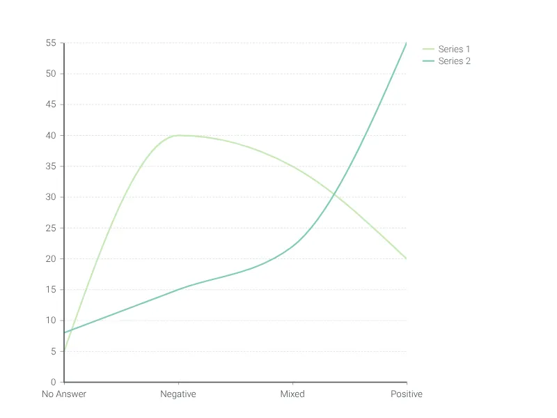
Dies ist ein Beispiel für Vizzlos "Liniendiagramm"
Ein einfacher, schneller und vielseitiger Liniendiagramm-Editor.